
Ayurvedic Wellness Solutions
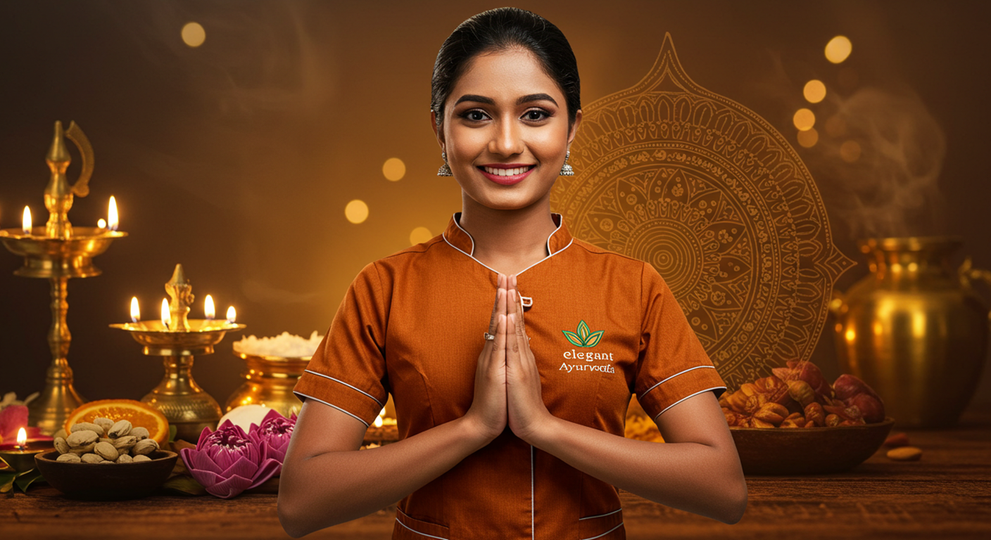
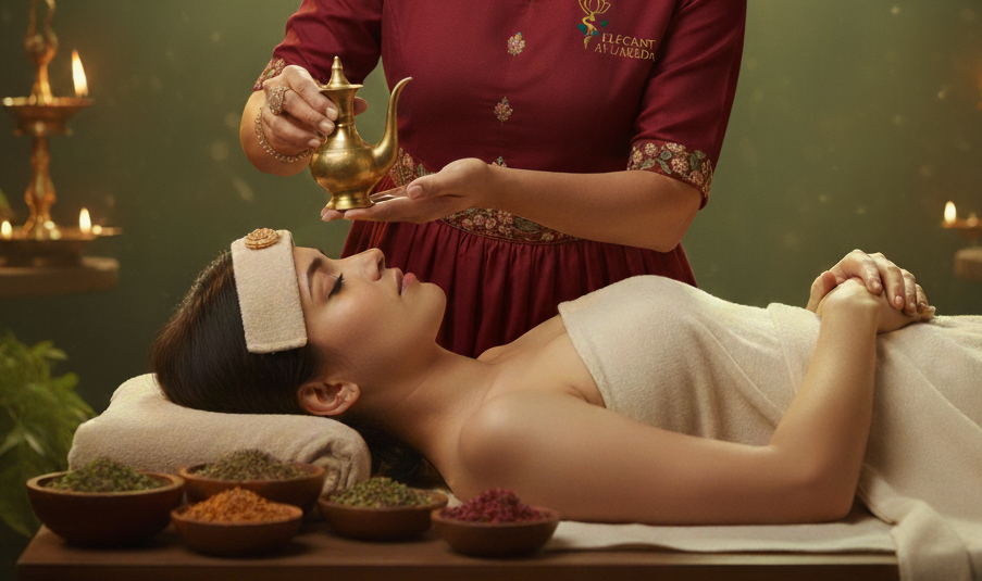
“Welcome to Elegant Ayurveda, where ancient wisdom meets modern wellness. Our mission is to guide you on a journey to true health and harmony through the timeless principles of Ayurveda and the rejuvenating power of Panchakarma.
Explore our site to learn about our authentic treatments, experienced doctors, and the serene facilities we offer. We believe in treating the root cause of illness, not just the symptoms, helping you achieve lasting balance and vitality. We look forward to helping you rediscover your well-being.”
Our Service
Panchakarma Detox & Rejuvenation
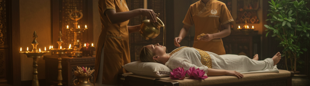
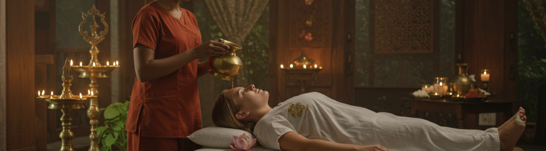
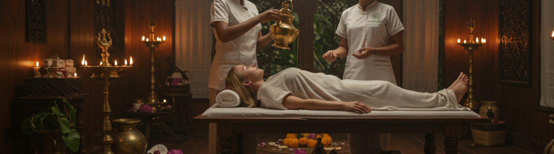
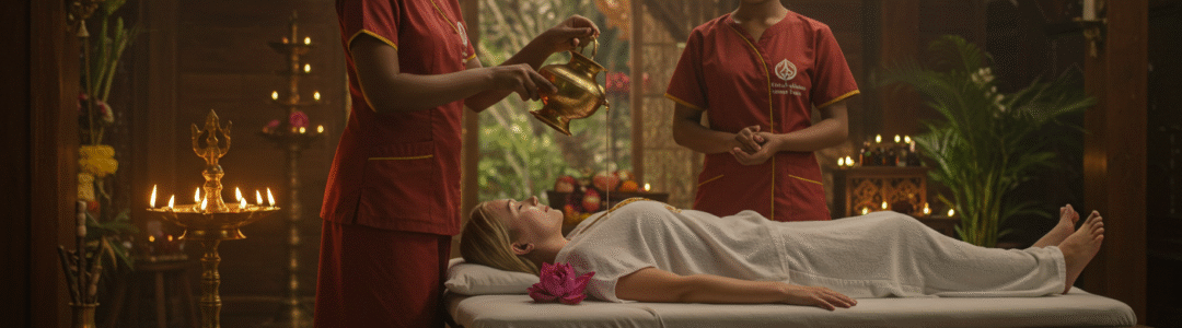
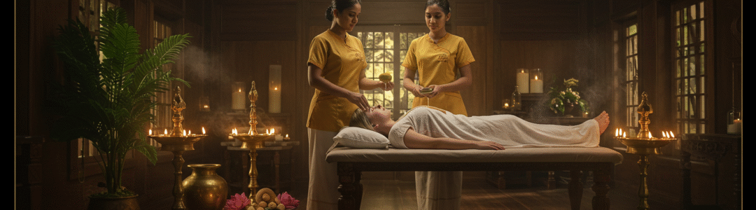
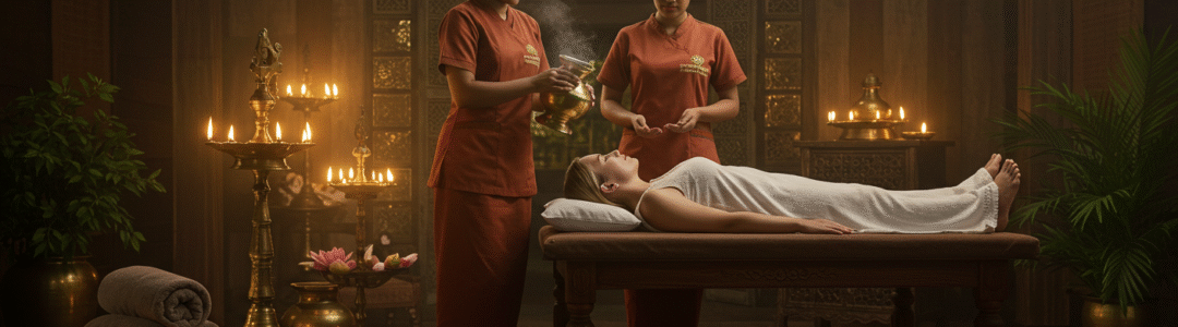
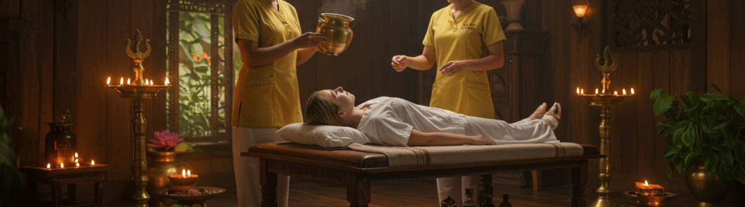
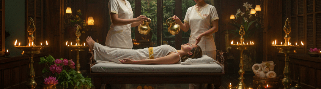
Our Ayurveda Panchakarma programs provide deep detoxification and rejuvenation. With traditional therapies, herbal oils, and time-tested techniques, we help cleanse the body of toxins, strengthen immunity, and restore inner harmony.
Yoga & Mindful Living
Complement your Ayurvedic treatments with yoga sessions, guided breathing, and meditation practices. Our yoga programs help cultivate strength, flexibility, and peace of mind, making your healing experience complete.
Herbal Treatments for Wellness
Using the richness of Sri Lanka’s natural herbs, we provide personalized herbal remedies for a wide range of health conditions—from stress and fatigue to chronic illnesses. Every treatment is guided by experienced Ayurvedic doctors.
Why Choose Elegant Ayurveda?
Authentic Ayurveda with certified practitioners
Peaceful and culturally rich setting in Sri Lanka
Tailored programs for international guests
A holistic approach—healing body, mind, and soul
64 Reviews ( 1 out of 5 )
Keeping track of generated audio revisions
I am preparing a generated backing guide for a bassist who records remotely. It works as an arrangement sketch, yet its texture might make the recording brief less clear. Alongside the guide, I can send tempo information, chords, the key, and notes on bass entrances. Is it useful to provide both the untouched guide and a revised version? The wording I found was suno fix in that search, though I have no personal results from the linked resource to report. The goal is a clear musical brief that does not turn an unwanted texture into an instruction. The bassist will work in a different recording application, so I would also welcome advice on export format, a shared starting point, and whether a count-in helps prevent alignment mistakes. Which details belong in a concise handoff checklist for a remote recording session?
Teaching an audio export comparison
I am planning a short background loop for a display that will run continuously during an exhibition. The main constraint is a smooth return from the end of the file to its beginning. I want to treat that boundary separately from any distracting texture elsewhere in the track. I bookmarked remove suno artifacts while gathering possible references for the second question. I would begin by finding a suitable loop region and listening to its transition several times. The playback system also needs checking because the actual player may introduce a gap between files. Only after that would I decide whether an internal texture deserves a separate experiment. Any trial version would stay alongside the original so that the musical character remains easy to compare. The final check would use the actual speakers and the expected exhibition playback level. Are there practical loop-preparation checks that are easy to overlook in a small exhibition?
Пляжный отпуск без лишних переездов
Обсуждаем поездку с друзьями, в которой автомобиль не будет обязательной частью отдыха. Жильё пока выбираем, поэтому есть возможность заранее проверить, насколько удобно добираться до нескольких разных пляжей. Долгие переезды с несколькими пересадками стараемся сразу исключать. Всё же хочется увидеть несколько мест, а не один пляж возле жилья. Пока составляем небольшой список выездов и для каждого отдельно проверяем путь туда и обратно. Самое слабое место плана — возвращение вечером. Для общей оценки расходов смотрим тему цены в испании и также проверяем, насколько простым будет сам маршрут. Хотим проверять последний рейс вместе с расстоянием от берега до остановки. Особенно если кто-то задержится за ужином или группе понадобится больше времени на сборы. Хочется также узнать, легко ли купить обратный билет заранее и где лучше проверять изменения расписания перед выездом. Какие пляжные выезды вы бы оставили в таком формате? Буду рад советам о разумном запасе времени перед последним рейсом.
Практические вопросы перед поездкой
Едем в Прагу с дошкольником и заранее продумываем день на случай дождя, чтобы не принимать все решения на улице. Мы не стремимся собрать много достопримечательностей: важнее немного погулять, дать ребёнку поиграть и вовремя сделать перерыв на еду. Для начала смотрю материалы по запросу детский остров Прага. Пока пытаюсь оценить, получится ли оставить эту остановку необязательной и выбрать её уже на месте по погоде и настроению. Пригодится идея для спокойной остановки в помещении, если прогулку придётся сократить, но возвращаться в гостиницу будет ещё слишком рано. Проверяю практические детали: где сделать санитарную паузу, как добраться обратно и получится ли поесть без долгого ожидания в очереди. Если у вас был похожий день в Праге, поделитесь связкой мест, которую удалось легко изменить без лишних поездок и спешки. Актуальные часы работы посмотрю ближе к поездке, а пока хочу понять, насколько разумно соединять предложенные места в один спокойный день.
How do you use a palette when choosing hair color?
I have a salon appointment coming up, and I am trying to narrow down a hair color before I get there. I recently started reading about color analysis because the tones I like in photos do not always look the same next to my face. It has been a long time since I last changed the color, and I want to go slowly. The result suggests a cooler palette, but I am treating that as a starting point rather than a rule. My natural hair is medium brown, and I want a change that is noticeable without committing to constant upkeep. Photos of muted brown and darker blonde appeal to me, but salon lighting may be doing much of the work. I also know that a dye swatch can look different against skin, eyebrows, and the color already in the hair. Would you start with in person swatches rather than picking a shade from a screen? I can bring daylight photos and explain my maintenance budget. A practical conversation about maintenance may matter more than a label from a quiz. I can also ask about a strand test before committing to the whole head. If you have made a similar change, which small details helped you avoid a color that looked too flat or too harsh? Examples from people who started with medium brown hair would help me compare options.
Checking hair color during a remote consultation
I recently stopped covering my gray hair and the changing contrast is making some dependable clothes look unfamiliar near my face. I want to observe the transition patiently while continuing to use most of what I own. Charcoal continues to feel practical, but a few warm beige and brown tops now seem disconnected from the cooler hair around my temples. I do not want to replace everything during the transition, especially because the dyed lengths will remain for quite a while. I have been reading this personal color analysis to record fabric comparisons over time instead of relying on one photograph. Would repeating three test colors be more useful than a full palette, and should I then wait until more natural hair has grown before changing larger pieces? Accessories may provide a temporary bridge without replacing basics. How would you stage this reassessment over the next year?
Keeping a small wardrobe palette
I'm thinking about changing my hair color, but I want to understand my undertone first. My phone photos look quite different depending on the room. In daylight my skin looks fairly neutral, while the bathroom light makes it look much warmer. I suspect the lighting is affecting what I see. I don't want to pick a hair shade based on one misleading picture. Would you use indirect daylight beside a window? I'm also unsure whether to compare my face with a white shirt, a gray background, or several fabric colors. I have tried the vein check, although the result is unclear. I found this page while looking into skin undertone test camera and plan to use it as a starting point for comparing colors rather than treating one result as a verdict. Has anyone found a simple way to repeat the test without changing the lighting? I can wear the same neutral shirt in every photo. That should make changes in the light easier to spot. I'd especially appreciate advice from anyone who checked their palette before making a hair appointment. I can take a few new photos this weekend.
Trying to separate face shape from color palette advice
I am replacing my glasses and keep getting different advice about which frames suit my face. A shop assistant called it round, but I suspect the camera angle and the frame width are affecting those impressions. Before trying more frames, I want a more consistent way to look at the outline of my face. I have tried looking at my forehead, cheeks and jaw together, yet even small changes in lighting seem to change what I notice. For another reference I came across color analysis while thinking about how glasses work with the rest of my appearance. That made me realize that color and shape are separate questions. To focus on proportions, I am considering a face shape check before comparing frames in person. Would you compare several straight-on photos, or is there a better way to avoid a misleading first impression? I would like to hear if people found that their apparent face shape changed when they switched lenses or stepped farther from the camera. I would prefer to make a simple repeatable check before buying a pair based on a label that might be wrong. What has worked for you?
Privacidad y detalles practicos en hoteles burbuja
Estoy pensando en hacer una escapada de una noche cerca de Barcelona por mi cuenta y me atrae la idea de dormir en una burbuja, aunque quiero plantearlo con bastante sentido practico. En este tipo de plan me fijo en la privacidad real, la iluminacion del camino y la facilidad para contactar con el alojamiento si surge una duda. Intento no elegir un sitio donde las parcelas esten demasiado juntas o donde la descripcion deje preguntas basicas sin responder. hotel burbuja barcelona Cuando leo opiniones me fijo mas en detalles como ruido, limpieza, acceso nocturno y trato del personal que en fotografias muy retocadas. Antes de elegir me sirve que la descripcion explique con claridad la distribucion del espacio. Quisiera saber si hay normas claras sobre llegadas tardias, desayuno y uso de las zonas comunes. Un comentario detallado vale mas para mi que una promesa demasiado perfecta. No necesito una experiencia de pelicula. Para mi bastan tranquilidad, buena organizacion y un espacio donde descansar sin incomodidad. Para quien tenga experiencia reciente ?que senales os sirvieron para saber que el lugar era adecuado?
?Que preguntar antes de una escapada burbuja?
Estoy organizando una sorpresa de aniversario y pense en una noche bajo las estrellas, en una burbuja con privacidad. No necesito lujos exagerados; prefiero que todo este bien explicado y que podamos descansar. Me preocupa sobre todo que ocurre si cambia el tiempo o si la parcela queda demasiado expuesta. Para preparar una lista de preguntas revise esta lista de detalles utiles. Quisiera saber si el personal informa con antelacion sobre lluvia, viento o cambios de temperatura. La comunicacion debe ser rapida. La parcela tendria que sentirse apartada. El aparcamiento debe quedar accesible. La entrada tiene que ser tranquila. La iluminacion deberia resultar discreta. La ropa de cama debe estar fresca. El clima interior tiene que permanecer estable. El bano deberia ser bien cuidado. La cena opcional tendria que estar bien detallada. El desayuno debe ser completo. La salida deberia ser tranquila. El entorno tiene que conservar un ambiente respetuoso. ?Alguien ha reservado una fecha especial y encontro util preguntar por el plan alternativo? Gracias por compartir ideas.